
OOROO Auto
Redesigned the digital experience for a modern auto repair brand — turning a high-anxiety booking process into a clear, confidence-building user journey.
Client:
OOROO Auto
Category:
Product Design, UX Strategy, UX Writing
My Role:
UX Strategist & Writer
Collaborators:
Frontend Developer: Dillon Walker
Creative Director: Wayne Holt
The Problem
Auto repair is a trust problem disguised as a service problem.
Customers enter with little technical knowledge, high financial uncertainty, and often negative past experiences. Most auto repair websites amplify this — technical language, unclear service descriptions, confusing booking flows.
OOROO's in-person experience built trust. The digital experience didn't carry it.
Research → Insight
Users weren't trying to understand services. They were trying to decide whether to trust the business.
Across the experience, users looked for three things: clarity on what they were getting, predictability in what would happen next, and confidence they were making the right call.
Trust is built through understanding, not persuasion.
The site needed to remove unknowns — not add more information.
Structure
I reframed the site as a decision support system rather than a marketing surface.
Every page moves users closer to booking by answering three questions: what is this, why does it matter, and what happens next. The structure guides users from understanding to validation to action.
Linear, clear, and designed to reduce hesitation.
Information Architecture
The existing structure required too much interpretation. Services were organized around internal categories, not user intent. Competing CTAs diluted focus.
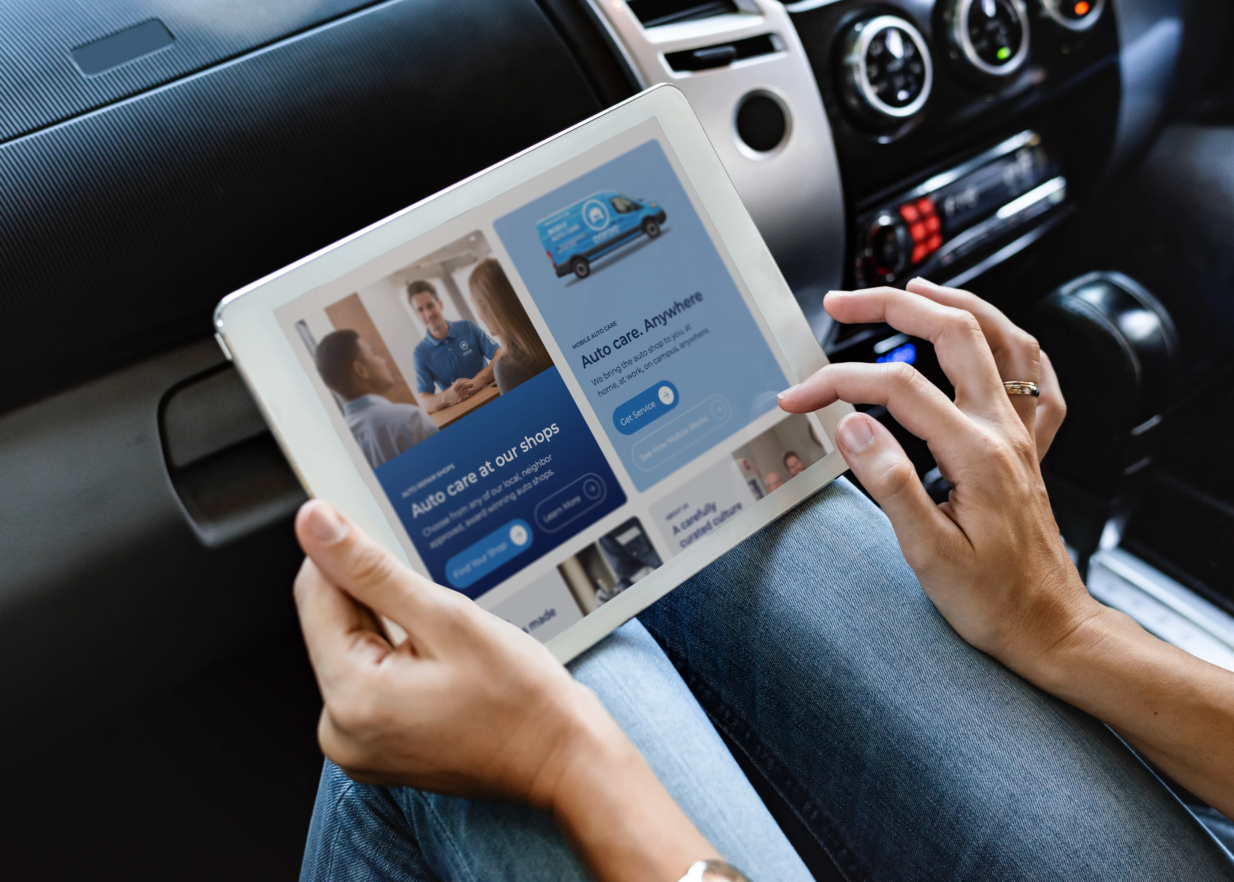
I simplified the path: navigation aligned to user intent, page structure that supports forward movement, and a single clear action at every decision point.
The result feels guided — even for users with no prior knowledge of auto repair.
Experience Design
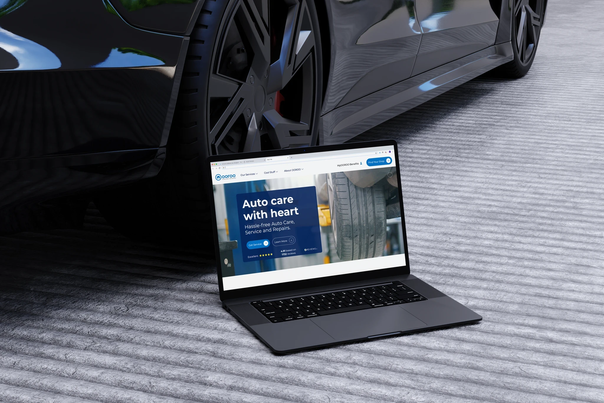
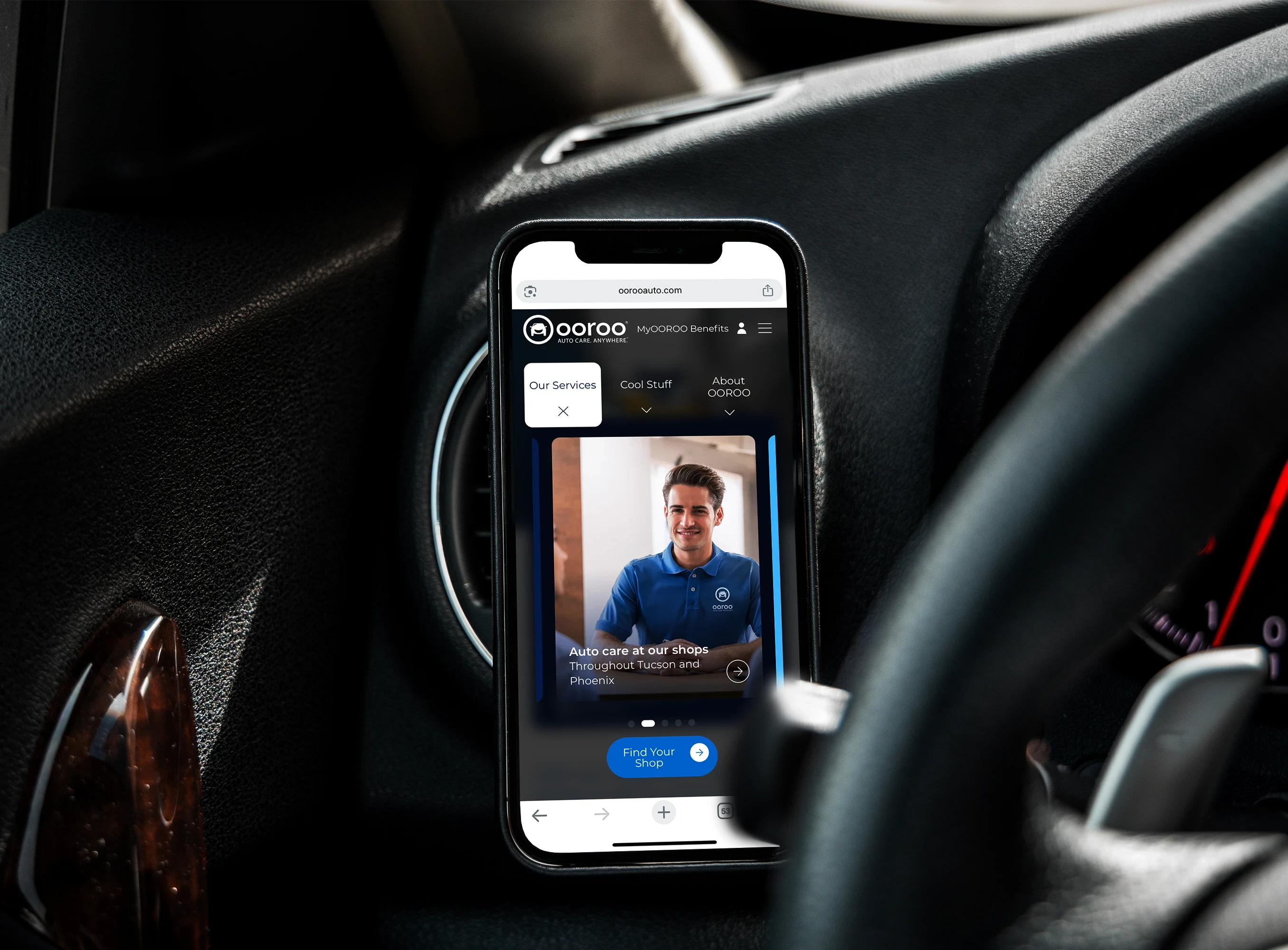
The homepage establishes clarity and reassurance immediately — who OOROO is, what makes them different, and what to do next.
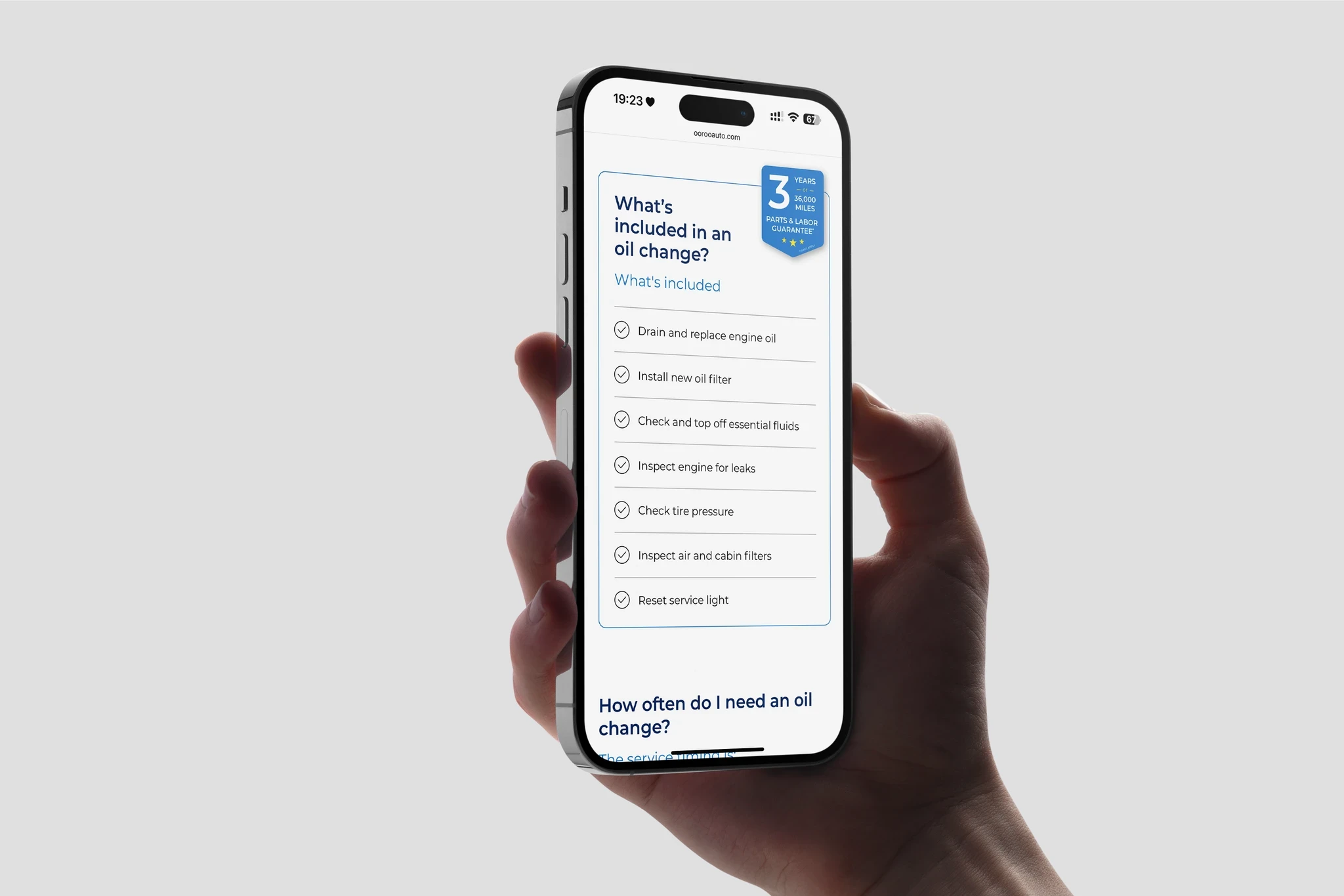
Service pages eliminate ambiguity. Each one explains what the service is, when it's needed, and what the outcome will be. No jargon, no assumptions about what the user already knows.
The scheduling flow was the highest-friction moment. I focused on reducing perceived commitment, setting clear expectations, and reinforcing trust at the exact point where users decide whether to book or bail. The copy does as much work as the interface.
Design System
Built around clarity and usability. Simple language, scannable layouts, consistent components across pages. Every element supports understanding and forward movement. Nothing decorative that doesn't also inform.
AI in This Project
This project was copy-intensive. Dozens of service descriptions, each needing to explain something technical in plain language while maintaining consistent tone.
I used AI for high-volume copy iteration — testing variations, refining tone across pages, and ensuring consistency at a scale that would have taken significantly longer manually. AI was particularly useful here for stress-testing clarity: if a generated variation was confusing, the source copy probably was too.
Impact
Reduced ambiguity at key decision points. Aligned the digital experience with OOROO's in-person trust. Positioned the brand as a modern, transparent alternative in an industry where that's rare.
What I'd Do Differently
I'd implement structured conversion tracking from day one. Measuring booking completion rates, drop-off points, and user behavior between service pages and scheduling would allow for precise optimization rather than directional improvement.