
SHIELD
Modernized a boots-on-the-ground property maintenance company into a credible digital platform — clarifying three distinct audiences, surfacing real work as proof, and giving a category leader a site that finally matches its reputation.

Client:
SHIELD Proactive Maintenance
Category:
Product Design, UX Strategy, Brand, Copy
My Role:
Design, Build
The Problem
Shield had won the market. The site hadn't caught up.
Over 80% adoption in San Antonio's single-family sector. Thousands of properties under active maintenance. A category-defining service model — and a previous site that had been abandoned mid-build. Property managers, homeowners, and tenants all landed in the same undifferentiated experience. The work was exceptional. The digital front door wasn't.
Strong reputation, weak digital signal. Word-of-mouth doing the lifting a website should share.
Research → Insight
This wasn't a services problem. It was an audience problem.
Property managers needed proof and process — something they could confidently hand to owners. Homeowners (typically 1–5 properties) needed to understand value without technical jargon. Tenants needed reassurance, not a sales pitch. Same company, three completely different decisions to support.
Shield's real product isn't repairs. It's certainty — knowing the exterior of a property is being looked after before anything breaks.
Structure
I rebuilt the site as a three-path system organized around who the visitor is.
Property managers, homeowners, and tenants each get a dedicated journey with language and proof calibrated to their stake in the property. Shared infrastructure — the SAVE program, before-and-afters, the team, warranties, storm response — sits underneath, surfaced where it matters most for each path.
The result is a site that feels purpose-built no matter which door you come through.
Information Architecture
The hardest work was separating offerings that overlap in reality but diverge by audience.
The SAVE program means something different to a property manager evaluating fiduciary fit than it does to an owner deciding whether to sign on. Storm response reads as risk mitigation to one audience and peace of mind to another. Tenant communications needed to feel welcoming, not transactional.
I built a navigation system that prioritizes audience before service, with shared programs reframed in the language each group actually uses. Clear at the surface, depth underneath.
Experience Design
The homepage establishes credibility immediately and routes visitors within seconds.
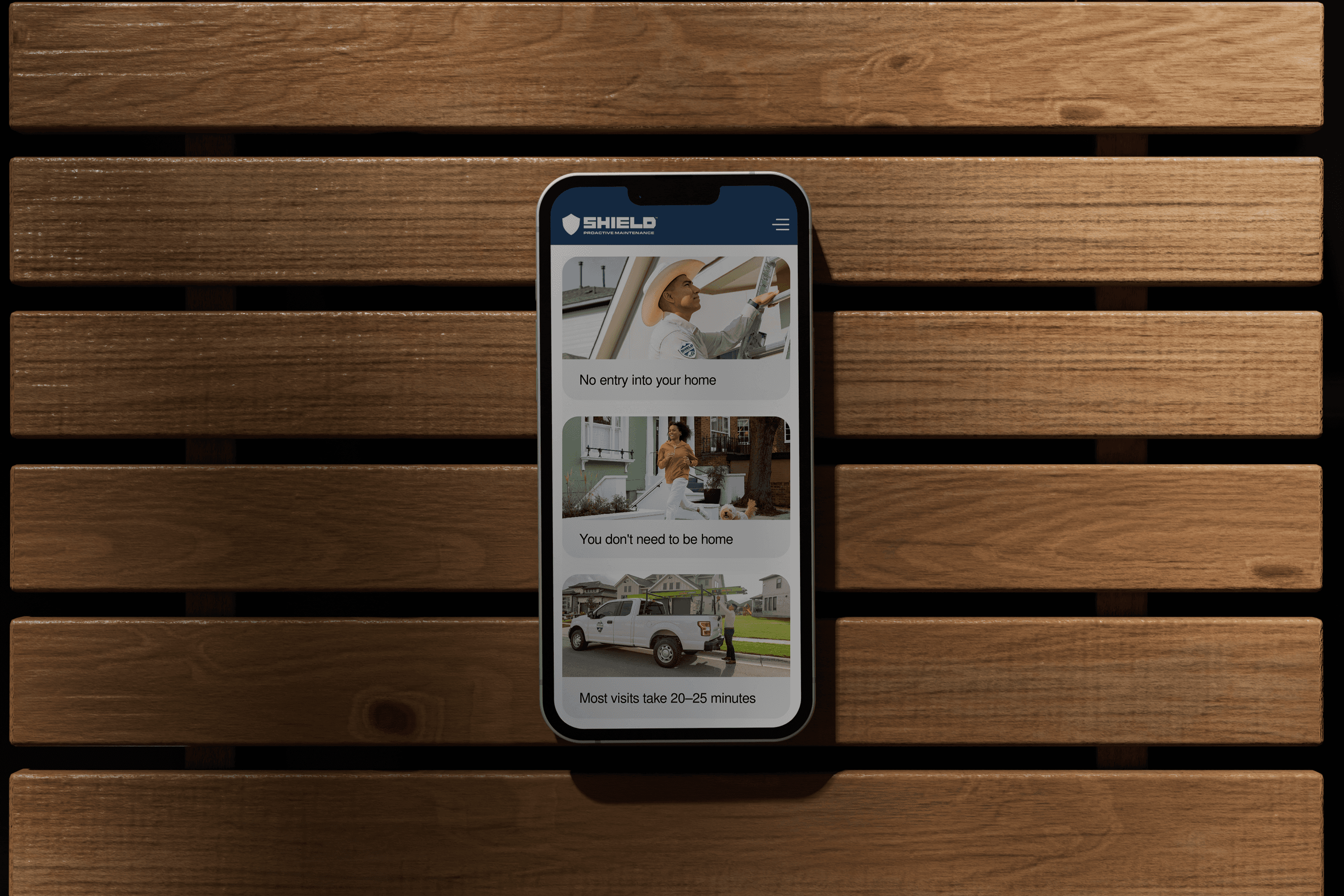
Image-forward, proof-forward, plain. Before-and-after documentation does the persuading. The SAVE program is explained in direct language without sounding boastful — unlimited exterior maintenance for one flat cost, annual assessments and video walkthroughs to keep everyone in the loop.
The homeowner journey leans into reassurance and asset protection. The property manager journey leans into reliability and reporting. The tenant journey leans into welcome and clarity — what to expect, when, and why.

Brand Modernization
The existing identity was strong but underused. I tightened its application across the site.
Type, spacing, and color were refined for an editorial, trustworthy feel — closer to how property managers expect a professional partner to present, and warm enough not to alienate homeowners or tenants. Photography became the loudest brand element: real properties, real repairs, no stock.
The system stays simple enough for a lean team to maintain as the company keeps growing.
Copy
Proof-forward, plain, and direct.
I wrote the full site — hero copy, program explanations, before-and-after entries, tenant communications, and team. The tone holds across every page: confident without being cocky, specific without being technical. Each before-and-after follows the same three-part rhythm so the gallery reads as documentation, not marketing.
AI in This Project
AI was the production layer. I used it across copy iteration, tone refinement, component logic, responsive behavior, and the front-end build in Framer. No dedicated front-end engineer on this project — AI let me translate design directly into production while keeping the copy and structure consistent across three audience paths.
Impact
A clear front door for three audiences. Reduced inbound friction for the property manager team. A platform that matches Shield's reputation as a category leader — and is built to scale into the owner portal and inspection app on their roadmap.
What I'd Do Differently
I'd test the audience-routing pattern with first-time visitors earlier. The three-path structure is the right call, but watching tenants and owners pick their lane in real time would have surfaced subtle language calls — especially around the SAVE program — sooner.